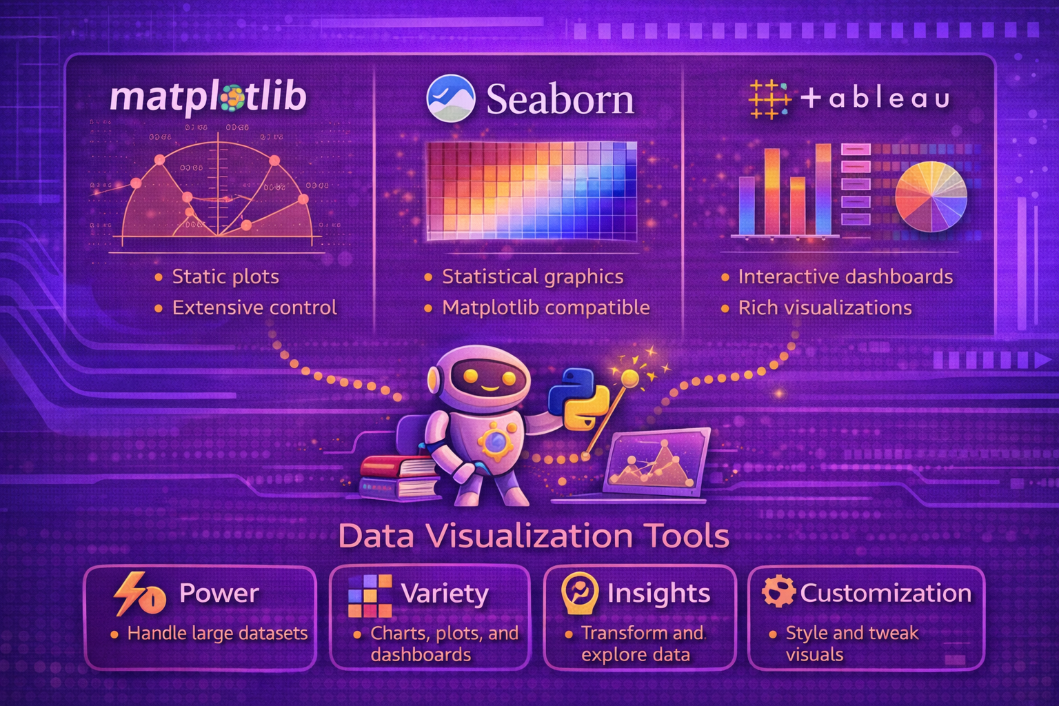
Data visualization is a core part of machine learning, analytics, and decision support because raw numbers rarely communicate structure, uncertainty, comparison, or trend as effectively as visual encodings. Good visualization tools help analysts move from data inspection to explanation, exploration, and storytelling. Among the most widely used tools are Matplotlib, Seaborn, and Tableau. Each serves a different role in the visualization ecosystem and reflects a different balance of flexibility, statistical abstraction, interactivity, and business usability.
Abstract
Data visualization is both a technical and communicative discipline. It transforms numerical and categorical data into visual structures that reveal distributions, trends, relationships, clusters, anomalies, and comparative patterns. Different visualization tools are built for different classes of problems. Matplotlib is a foundational Python plotting library with broad control over static, animated, and interactive plots. Seaborn is a higher-level statistical visualization library built on top of Matplotlib and integrated closely with pandas-oriented workflows. Tableau is a visual analytics platform focused on interactive exploration, dashboarding, and business-facing visualization without requiring users to write plotting code directly. This paper explains the principles of data visualization and compares these three tools in terms of abstraction level, use cases, strengths, limitations, workflow style, and technical fit across data science and analytics lifecycles. All formulas are embedded inline in HTML-friendly format for direct use in WordPress or similar editors.
1. Introduction
Let a dataset be represented as:
D = {(xi1, xi2, ..., xim)}i=1n.
A visualization can be seen as a mapping:
V : D → G,
where G is a graphical representation using marks, positions, colors, shapes, scales,
or interactive controls.
Good visualization is not only about plotting data. It is about preserving relevant structure while reducing cognitive effort for the viewer.
2. Why Visualization Matters
Visualization matters because it helps users:
- detect patterns and trends
- spot outliers and anomalies
- compare groups
- understand distributions
- communicate findings to technical and non-technical audiences
- debug models and data pipelines
In machine learning, visualization is often essential for exploratory data analysis, model interpretation, performance comparison, and stakeholder communication.
3. Data Visualization as an Encoding Problem
A chart maps variables onto visual channels such as:
- position
- length
- color
- size
- shape
- facet or panel structure
If variable x is mapped to horizontal position and variable
y to vertical position, then a simple scatter plot represents each record
(xi, yi)
as a mark placed at that coordinate pair.
4. Exploratory vs Explanatory Visualization
Visualization tools are often used in two broad modes:
- exploratory: helping the analyst investigate data and discover patterns
- explanatory: helping the analyst communicate a specific insight to others
A tool’s design is often shaped by which of these goals it supports most naturally.
5. Static, Interactive, and Statistical Visualization
Visualization tools differ in the kinds of output they prioritize:
- static: publication charts, reports, notebooks, exportable images
- interactive: filters, drill-down, hover, dashboards, live exploration
- statistical: plots that encode distributions, uncertainty, or model structure with minimal manual effort
Matplotlib, Seaborn, and Tableau differ strongly across these dimensions.
6. Matplotlib Overview
The official Matplotlib documentation describes Matplotlib as “a comprehensive library for creating static, animated,
and interactive visualizations” and the main project site describes it as “Visualization with Python,” adding that it
“makes easy things easy and hard things possible.” The pyplot reference also describes
matplotlib.pyplot as a state-based interface for interactive and simple programmatic plot
generation, while the API reference explains that Matplotlib has two interfaces, including an explicit object-based
Axes interface.
7. Matplotlib Design Philosophy
Matplotlib is best understood as a foundational plotting system with a very broad surface area. It is not limited to one chart family or one style of analysis. Instead, it gives users granular control over figures, axes, scales, labels, annotations, and rendering behavior.
This makes it especially powerful for users who need full control over plot construction, styling, and layout. This characterization is supported by its user guide, tutorials, pyplot API, and explicit object-based interface documentation.
8. Matplotlib Interfaces
Matplotlib supports two main ways of working:
- pyplot/state-based interface: convenient for quick plots and interactive usage
- object-based Axes interface: explicit figure and axes management for more controlled construction
The official API reference explicitly highlights these interfaces and recommends the explicit Axes-oriented pattern for more structured work.
9. Strengths of Matplotlib
- very broad charting flexibility
- strong control over low-level plot elements
- supports static, animated, and interactive visualizations
- excellent for publication-quality customization
- serves as a base layer for many other Python visualization libraries
These strengths are strongly reflected in the official documentation and examples ecosystem.
10. Limitations of Matplotlib
Matplotlib’s flexibility can come with more verbosity and a steeper path to aesthetically polished statistical plots than higher-level wrappers. It is extremely capable, but users often need to specify more details manually than they would in Seaborn or a dashboarding platform. This is an inference from the official interface design and scope, not a direct quote.
11. Seaborn Overview
The Seaborn home page describes Seaborn as “a Python data visualization library based on matplotlib” that “provides a high-level interface for drawing attractive and informative statistical graphics.” Its introduction tutorial states that Seaborn is a library for making statistical graphics in Python, that it builds on top of Matplotlib, and that it integrates closely with pandas data structures.
12. Seaborn Design Philosophy
Seaborn is best understood as a statistical visualization layer on top of Matplotlib. Rather than requiring users to specify every visual detail manually, it provides higher-level plotting functions that encode common analytical patterns such as distributions, pairwise relationships, categorical comparisons, and regression structure.
This makes Seaborn especially effective for exploratory analysis and statistically oriented visualization in data science workflows.
13. Statistical Orientation of Seaborn
Seaborn emphasizes plots such as:
- histograms and density plots
- categorical summaries
- joint and pairwise relationship views
- regression plots
- faceted comparison grids
For example, the official documentation for
lmplot
describes it as combining regression plotting with faceting to compare conditional subsets, and
regplot
includes bootstrap-based confidence interval behavior among its parameters.
14. Seaborn and Pandas Integration
The official introduction emphasizes that Seaborn integrates closely with pandas data structures. This is important because many data science workflows in Python operate directly on DataFrames, making Seaborn especially natural for quick exploratory analysis.
15. Seaborn Objects Interface
Seaborn also documents an objects interface, but the tutorial for that interface states that it is currently experimental and incomplete, though stable enough for serious use. This matters because it shows Seaborn continuing to evolve beyond only its classic functional API.
16. Strengths of Seaborn
- high-level statistical plotting with less code
- good default aesthetics
- strong support for DataFrame-centered workflows
- helpful abstractions for distributions, grouping, faceting, and regression
- builds on Matplotlib while reducing manual boilerplate
These strengths are directly supported by the Seaborn homepage and introductory tutorial.
17. Limitations of Seaborn
Because Seaborn sits at a higher abstraction level, it may provide less immediate low-level control than raw Matplotlib for highly customized publication designs. It is strongest when the visualization need matches its statistical plotting patterns. This is a reasoned comparison based on its documented role as a high-level interface built on top of Matplotlib.
18. Tableau Overview
Tableau’s official materials describe it as helping people “see and understand their data,” and the Tableau product overview describes Tableau as “a complete, flexible analytics platform for harmonizing, managing, and exploring data with interactive visualizations.” Tableau Desktop is described as data visualization software that lets users see and understand data quickly, connect to data from many sources, and explore with interactive views. Tableau help pages also define a “view” or “viz” as a visualization such as a chart, graph, map, plot, or text table.
19. Tableau Design Philosophy
Tableau is best understood as an interactive visual analytics platform rather than a Python plotting library. Its design centers on visual exploration, drag-and-drop analysis, dashboarding, and organizational use across technical and non-technical users.
The official product pages emphasize connecting to data, exploring interactively, and making insights accessible across the organization.
20. Tableau Workflow
Tableau workflows are often centered on:
- connecting to data sources
- dragging fields into rows, columns, color, size, or filters
- creating views and dashboards interactively
- publishing or sharing visual analytics
The Tableau help documentation explicitly frames a visualization as a “view” and encourages starting with a business question before building the view.
21. Strengths of Tableau
- strong interactive dashboarding
- accessible to many business users without writing plotting code
- good support for exploratory slicing and filtering
- designed for organizational sharing of visual analytics
- broad connectivity to multiple data sources
These strengths are reflected in Tableau’s product overview, Desktop positioning, and broader platform pages.
22. Limitations of Tableau
Tableau is not a direct replacement for Python plotting in programmatic scientific workflows. It is strongest in interactive analytics and dashboards, while highly custom code-driven statistical visualization and notebook-native workflows often remain more natural in Matplotlib or Seaborn. This is a practical comparison derived from the official positioning of Tableau as an analytics platform and Matplotlib/Seaborn as Python libraries.
23. Matplotlib vs Seaborn
Matplotlib and Seaborn are closely related, but they emphasize different user experiences:
- Matplotlib emphasizes broad control and foundational plotting flexibility.
- Seaborn emphasizes high-level statistical plotting and attractive defaults built on Matplotlib.
Seaborn is often used for speed and clarity in statistical exploration, while Matplotlib is often preferred when finer-grained control is needed.
24. Python Libraries vs Visual Analytics Platforms
Matplotlib and Seaborn are Python libraries that fit naturally into code-driven workflows. Tableau is a visual analytics platform that prioritizes interactive exploration and dashboard sharing across broader user groups.
The difference is not only technical but also operational: code-first visualization supports reproducible analytical pipelines, while platform-driven visualization supports broad organizational consumption and interactive analysis.
25. Typical Use Cases
A practical use-case mapping is:
- Use Matplotlib for custom publication plots, full plot control, animation, and foundational Python plotting.
- Use Seaborn for statistical exploration, distribution analysis, grouped comparisons, and faster attractive charts in Python.
- Use Tableau for dashboarding, interactive business analytics, self-service exploration, and broad stakeholder sharing.
26. Visualization in ML Workflows
In machine learning workflows, these tools support different stages:
- Matplotlib: diagnostic curves, custom confusion-matrix displays, learning curves, model debugging visuals
- Seaborn: feature distribution comparison, pair plots, category-wise analysis, statistical relationship plots
- Tableau: business-facing KPI dashboards, post-model monitoring views, stakeholder reports, operational analytics
27. Interactivity Considerations
Interactivity means different things in different tools. In Tableau, interactivity is a core first-class experience built around filtering, drill-down, and dashboard navigation. In Matplotlib, interactivity exists but is more often used in developer or desktop contexts than as a broad self-service analytics paradigm. Seaborn, as a Matplotlib-based library, is primarily oriented around high-level chart generation rather than full dashboard interaction. This comparison is supported by the official product descriptions and Matplotlib’s own description of supporting static, animated, and interactive visualizations.
28. Aesthetics and Defaults
A major practical difference is default aesthetic behavior. Seaborn was explicitly designed to make statistical graphics attractive and informative with less manual configuration. Matplotlib can achieve extremely polished output but often requires more deliberate styling choices. Tableau focuses on interactive analytic usability and visual clarity in dashboard contexts rather than low-level code styling.
29. Common Failure Modes
- using Matplotlib for rapid statistical exploration when higher-level Seaborn abstractions would be faster
- using Seaborn for highly custom publication needs that require direct Matplotlib control
- trying to replace reproducible code-first analytical pipelines entirely with a dashboard platform
- building dashboards without first clarifying the analytical question
- choosing a tool based on popularity instead of workflow fit
30. Best Practices
- Use Matplotlib when you need foundational control, precision, or custom rendering behavior.
- Use Seaborn when you want statistical visualizations quickly with strong defaults in Python.
- Use Tableau when interactive business exploration and dashboard sharing are the main goals.
- Choose the tool based on workflow, audience, and reproducibility needs rather than on feature lists alone.
- Start every visualization with a question and a comparison goal, not just with available chart types.
31. Conclusion
Matplotlib, Seaborn, and Tableau are all powerful visualization tools, but they serve different roles in the data ecosystem. Matplotlib is the foundational Python plotting library with broad control over static, animated, and interactive output. Seaborn is the higher-level statistical visualization layer that makes many analytical plots easier and more aesthetically polished. Tableau is the visual analytics platform built for interactive exploration and organization-wide communication.
The most effective tool choice depends on the problem being solved, the audience being served, and the workflow being followed. When used appropriately, these tools complement rather than replace one another and together cover much of the practical landscape of modern data visualization across technical analysis and business communication.